Releasing from the Month of July and Art Talk.
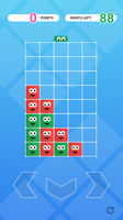

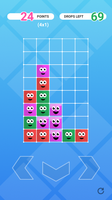
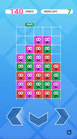
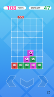
In our second month we created a puzzle game called 100 Drops.
This game was inspired by a combination of 2048 and PoyoPoyo. The idea is that you have to try to create combos with very little options of what you can do to make those combos.
Two Modes?
We started this game with two modes in mind. We wanted a short mode and a long mode. One where you had only 3 colors and limited drops to try and get a high score, and one where you started with just 2 colors and slowly built up all the way to 6 colors and a much larger board.
While creating the game we realized that we needed to pick one of these modes to focus on in order to really finish the game in just a month. We went with the shorter 100 Drops mode because we found that more people enjoyed playing that mode during our play tests.
This mode is much easier to pick up and put down on a bus or waiting for that build to complete. And we found it had more replay-ability as well.
Art
This game originally started with the most basic color grid system you can imagine.
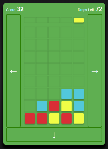
From here I tried to go with a more techy feeling to the game. I always seem to try that mode first before I go cute.
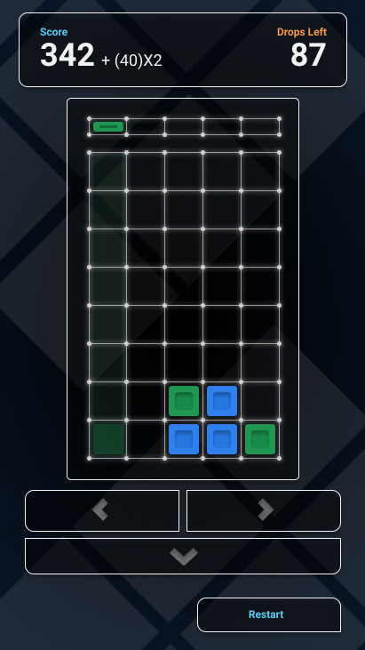
You can see here that I do keep a number of elements from this style into the final version of the game. From this point is about when the game was progressing far enough that we could start porting it into Unity.
After talking to a number of people and showing them the game design I realized that techy wasn't really that interesting. And so I went cute. Decided to give the blocks a little face that would get happy as they got combo'd. This was the first look in Unity.
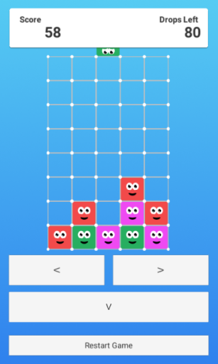
As you can see here I have the little dudes representing. They aren't quite as defined as they would end up. But it definitely has more spirit. I originally also wanted them to start sad and get happier as more friends got near them.

But this didn't end up making it into the game, so they start happy and then just get really happy when they get popped.
I also decided that this UI just wasn't acceptable when it came to releasing a game. So I went back with 2 days left in the month to re-create the whole UI.
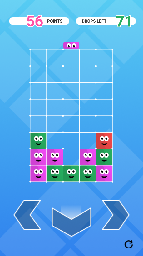
My main focus in this redesign was thinking about how people would play the game on mobile. I noticed when people would try and play the game with the 2 buttons above the other one, they would often miss-click as they tried to play the game quickly.
I decided that I needed a 3 across option so that the player would have clear areas they could click to move the board. I was really glad how this redesign turned out. The game has a really consistent feel to it that I wasn't able to get in Phase Drop.
Overall this game definitely turned out to be one that we could really be proud of.
If you have any questions please feel free to ask anything in the comments below!
100 Drops
Drop and shift blocks and create combos of 4 or more to score points!
Leave a comment
Log in with itch.io to leave a comment.